



Power of White Space -- Yohaku
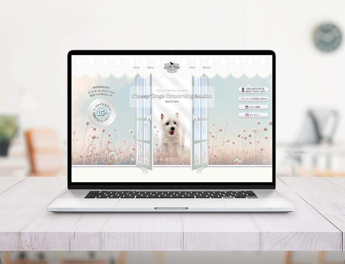
Sometimes, I visit a website and immediately feel calmer. Not because the
design is particularly flashy or impressive. Actually, it is often the
opposite. The page feels quiet. There is space between things. Nothing is
competing too hard for attention.
As someone still learning design myself, I’ve started noticing how much
this feeling often comes from something very simple: white space. Or, in
Japanese, 「余白」(yohaku).
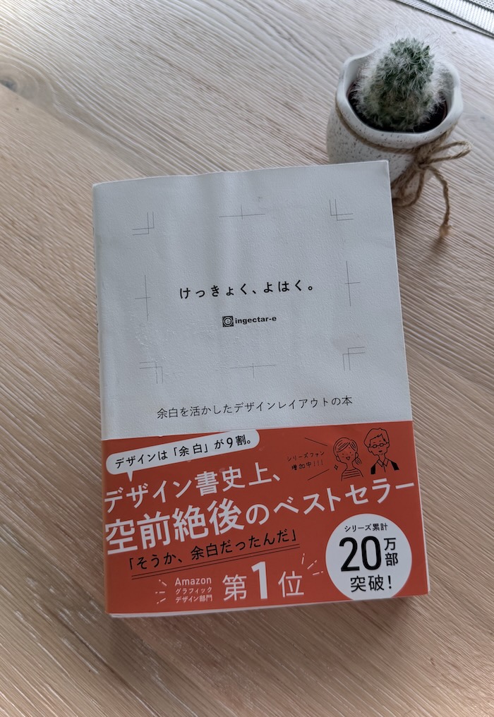
A while ago, I came across a beautiful Japanese design book called 「けっきょく、よはく。」 (“In the End, It’s All About White Space.”) The book shows many examples of layouts before and after adjusting spacing. The changes are surprisingly subtle. And yet, once the spacing is improved, everything begins to feel softer, clearer, and easier to read. It reminded me that good design is not always about adding more. Sometimes, it’s about knowing what to leave untouched.
「けっきょく、よはく(kekkyoku yohaku)」from Amazon Japan
Sometimes white space is strongly associated with minimalism. But as I’ve gained more experience, I’ve started to see it less as a visual style and more as a tool for communication. A little more space between paragraphs can make reading feel calmer and easier to follow. Margins around an image can reduce visual pressure and help the content breathe. White space is no longer just about making a layout look “minimal.” It’s about improving readability, creating clarity, and helping people move through information more intuitively.
Sample Comparison: How White Space Changes Communication
At first glance, both of these layouts may feel “designed.”
They use similar colors, typography, textures, and imagery. But once you begin comparing them side by side, the difference in breathing room completely changes how the information feels.
What Changes with More White Space?
- The viewer’s eyes know more naturally where to look first
- Decorative elements stop competing with the main message
- The product itself becomes easier to recognize and remember
- The layout feels calmer and less visually overwhelming
- Information gains a clearer sense of hierarchy
- The overall impression feels more refined and intentional
In the first version, decorative elements compete for attention, and the eye keeps moving around the layout. In the second version, the spacing creates a clearer visual path, allowing the viewer to naturally focus on the product and message. Nothing dramatic was added. In fact, some elements were simply reduced or given more room. But that small shift changes the entire experience.
This is the quiet power of white space. It doesn’t just make a design look cleaner — it helps information feel calmer, clearer, and easier to trust.
 Competing Elements
 Focused Message
Efficiency vs Clarity vs User Experiences
In many modern websites, efficiency becomes the priority. Everything is optimized to keep people moving quickly. And of course, clarity matters. But I also think there is value in allowing people to slow down a little while reading. Not every layout needs to push for attention all the time. Sometimes, a calmer experience can feel more memorable.
From a UX perspective, white space also makes things easier to understand. Text becomes more readable. Buttons become easier to notice. Content feels less overwhelming. But beyond usability, I think yohaku also affects emotion. Layouts with breathing room often feel more thoughtful and less stressful to spend time with. At least, that’s how they feel to me.
Some Spacing Values I Personally Like Using:
| Element | My Personal Preference | Example CSS |
|---|---|---|
| Space between sections | 80–100px | section { padding-block: 80px; } |
| Mobile section spacing | 48–64px | @media (max-width: 768px) { section { padding-block: 56px; } } |
| Reading width for blog text | around 680px | .blog-content { width: min(680px, 90%); margin-inline: auto; } |
| Line height for paragraphs | around 1.7–1.9 | p { line-height: 1.8; } |
| Space between paragraphs | around 1.2–1.5em | p + p { margin-top: 1.4em; } |
| A4 poster margins | around 20–30mm | @page { margin: 25mm; } |
| Small UI spacing rhythm | multiples of 8px | gap: 8px / 16px / 24px / 32px; |
Of course, spacing always depends on the project and the feeling you want to create. Sometimes tighter layouts make sense too. But personally, I often notice that when I leave a little more room between things, the overall experience starts to feel calmer and more natural.
Finding the Right Balance
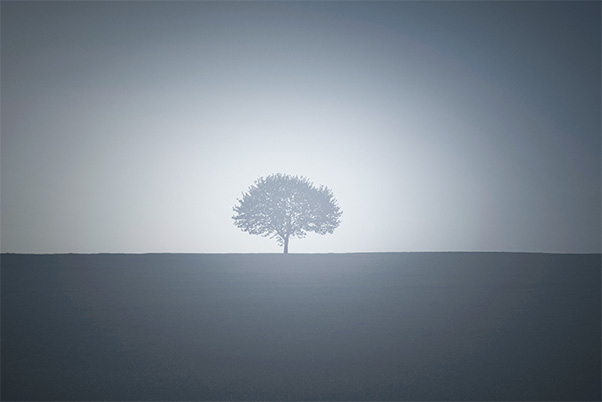
Over time, I’ve become more drawn to layouts that leave room for pause. Not every space needs to be filled. Sometimes, the feeling of a design comes from what is left untouched.