



Different Cultures, Different Digital Experiences

When we look at web design around the world, every region has its own unique design language and strengths. From the clean, highly structured interfaces often seen in North America and Western Europe, to the dynamic and information-rich experiences common across Asia, there is an incredible amount of creativity and thoughtfulness everywhere.
Personally, I find inspiration in all of these approaches. Different cultures naturally shape different expectations around communication, trust, usability, and visual comfort — and that diversity is part of what makes web design so fascinating.

As a small disclaimer, I’m not a design authority or UX researcher — just someone who genuinely enjoys observing websites and thinking deeply about digital experiences. These are simply my own personal impressions shaped through years of living and working across different cultures.
The Softness and Reassurance of Japanese UX
One thing I’ve often noticed about Japanese websites is that they tend to prioritize reassurance and emotional comfort alongside functionality.
Some common characteristics often include:
- {' '} Information-rich layouts that help users feel informed and secure
- Softer color palettes with muted tones, gradients, and natural textures
- Friendly visual elements such as illustrations, mascots, or handwritten accents
- A stronger sense of guidance and explanation throughout the experience
In contrast, many Western interfaces often place a stronger emphasis on clarity, speed, minimalism, and efficiency. Neither approach is inherently better — they simply reflect different communication styles and cultural expectations.
| Design Approach | Common in Western UI | Often Seen in Japanese UI |
|---|---|---|
| Layout Style | Minimal and spacious | Information-rich and layered |
| User Guidance | Self-directed exploration | More guided and explanatory |
| Visual Tone | Clean and efficient | Warm and approachable |
| Use of Color | High contrast and bold accents | Muted tones and softer palettes |
| Emotional Feeling | Streamlined and direct | Comforting and reassuring |
What Makes a Digital Space Feel Comfortable?
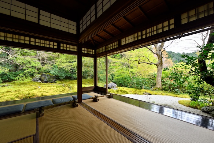
Personally, I’ve always been drawn to the softer, more layered feeling often found in Japanese digital design. Even when a page contains a large amount of information, there is often an intention to make the experience feel welcoming rather than purely transactional.
To me, that subtle sense of warmth — sometimes connected to the Japanese idea of omotenashi — is what makes certain digital spaces feel more human and emotionally comfortable.
As digital products become increasingly global, I think there’s a lot we can learn from blending these different approaches together.
What makes a website feel welcoming or comfortable to you?